Below the timeline are three more charts. Each asks a different question about the same week.
Push-ups After Delivery
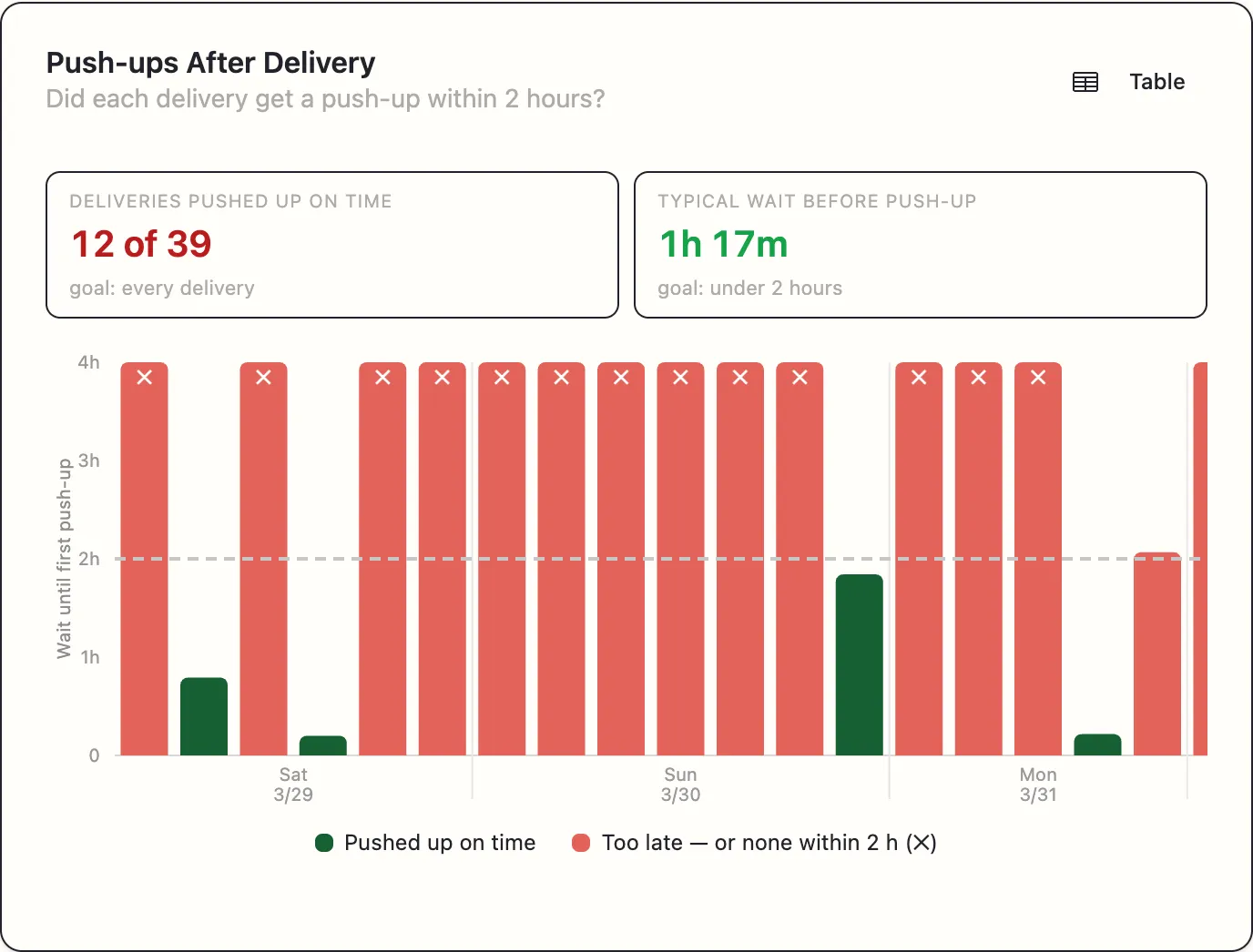
Did each delivery get a push-up within 2 hours?
The most directly actionable chart on the report. Fresh feed is when cows eat hardest and push it furthest out of reach, so a delivery that gets no push-up service in its first two hours has wasted its best window.
Two tiles at the top:
- Deliveries pushed up on time — 12 of 14 — goal: every delivery
- Typical wait before push-up — 45 min — goal: under 2 hours
Then one bar per delivery, grouped by day, with a dashed line labelled goal: within 2 h:
- Green bar — pushed up on time.
- Red bar — too late.
- Full-height red bar with a ✕ — no push-up at all within two hours.
The ✕ matters: colour is never the only signal on this chart, so it reads correctly if you are colour-blind or printing in black and white.
A Table toggle shows the same thing as rows — Delivery · First push-up · On time? — which is easier to copy into a note for whoever drives the alley.
You may see a footnote:
2 deliveries not shown — the camera didn’t cover the 2 hours after them.
Deliveries near the end of the recording, or before a gap, cannot be judged fairly and are left out rather than counted as failures.
If the chart is empty: Not enough data for this chart — it needs at least one delivery with its full 2-hour window on camera.
Reading it: scattered red is a discipline problem. Red concentrated on one day is a one-off. Red on every evening delivery is a shift-pattern problem — nobody is doing the last push-up.
Feed Pushups vs Empty Bunk Time
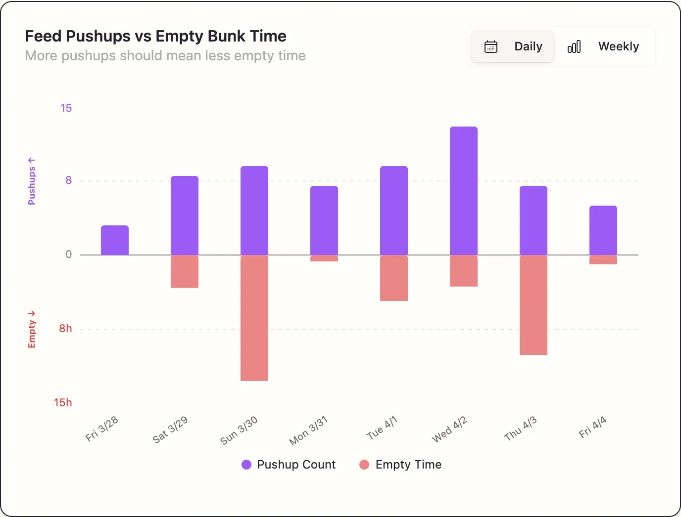
More pushups should mean less empty time
A mirrored chart: purple bars above the centre line count push-ups, red bars below show hours the bunk was empty. A Daily / Weekly toggle changes the grouping.
The chart is testing a relationship on your own farm. If more push-ups genuinely means less empty time in your barn, the bars mirror each other — tall purple above, short red below. If they move together instead, push-ups are not what is limiting you, and you should be looking at delivery volume or timing.
That is a genuinely useful thing to know before you ask somebody to drive the alley more often.
Feed Event Time Variations
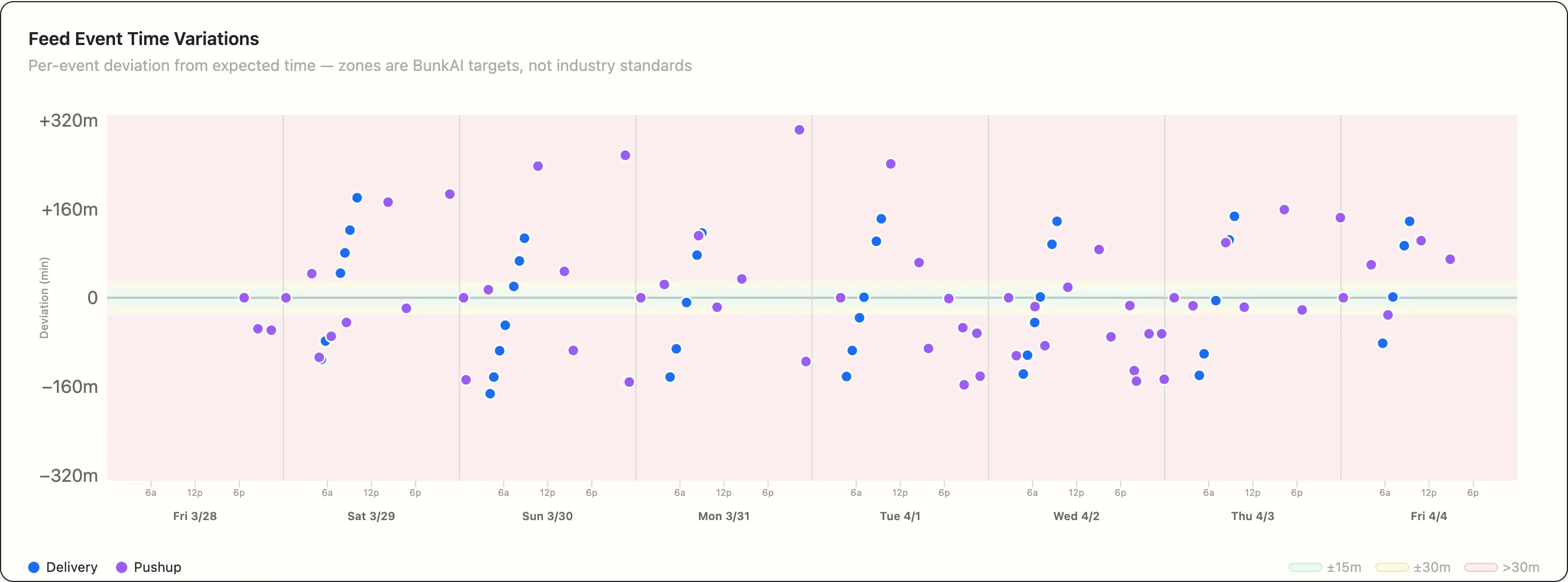
Per-event deviation from expected time — zones are BunkAI targets, not industry standards
A scatter chart. Each dot is one event — blue for deliveries, purple for push-ups — placed by day and time of day, with the vertical axis showing how far it landed from its expected time in minutes.
The background is banded:
| Zone | Deviation |
|---|---|
| Green | Within 15 minutes |
| Amber | 15 to 30 minutes |
| Red | More than 30 minutes |
Note the subtitle carefully. Those bands are our targets for reading consistency, not an industry standard, and you should treat them as a guide rather than a grade.
Hovering gives the detail — Del 3 · Mon 7/7 / Time: 06:10 / Deviation: +12.0m late.
Reading it: a tight horizontal band of dots near zero is a consistent routine. Dots drifting steadily downward or upward across the week means your times are sliding. One dot far out on its own is a single late day, which is worth naming but not worth changing your routine over.
A note on the charts you get
Which charts appear depends on what your footage supports. A chart that does not have enough data to be meaningful says so rather than drawing a misleading picture — for example, Push-ups After Delivery needs at least one delivery with its full two-hour window on camera.
The set of charts also changes over time as we add to the report. If you have seen a chart on an older report that is not on a newer one, that is deliberate rather than a fault.